Stacs Landing Page
Credit & Savings, Simplified
Making sense of credit and savings shouldn't feel like decoding a secret manual. This redesign for Stacs transforms complex financial offerings into a clear, user-friendly experience—helping users borrow, save, and choose flexible payment plans with confidence
Client
Stacs.co
Services
Visual Design UI & UX Design
Industries
Fintech
Date
April 2024
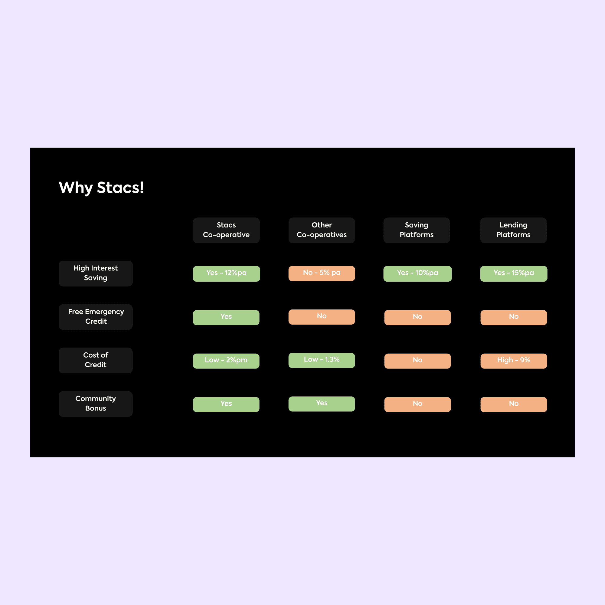
The goal was to create a more engaging and structured landing page that clearly showcases Stacs' various financial offerings, including borrowing, saving, and flexible payment plans. The redesign focused on intuitive layouts, visual hierarchy, and interactive elements to help users quickly understand their options. By refining the UI and optimizing content flow, the new design makes financial decisions feel seamless and approachable.
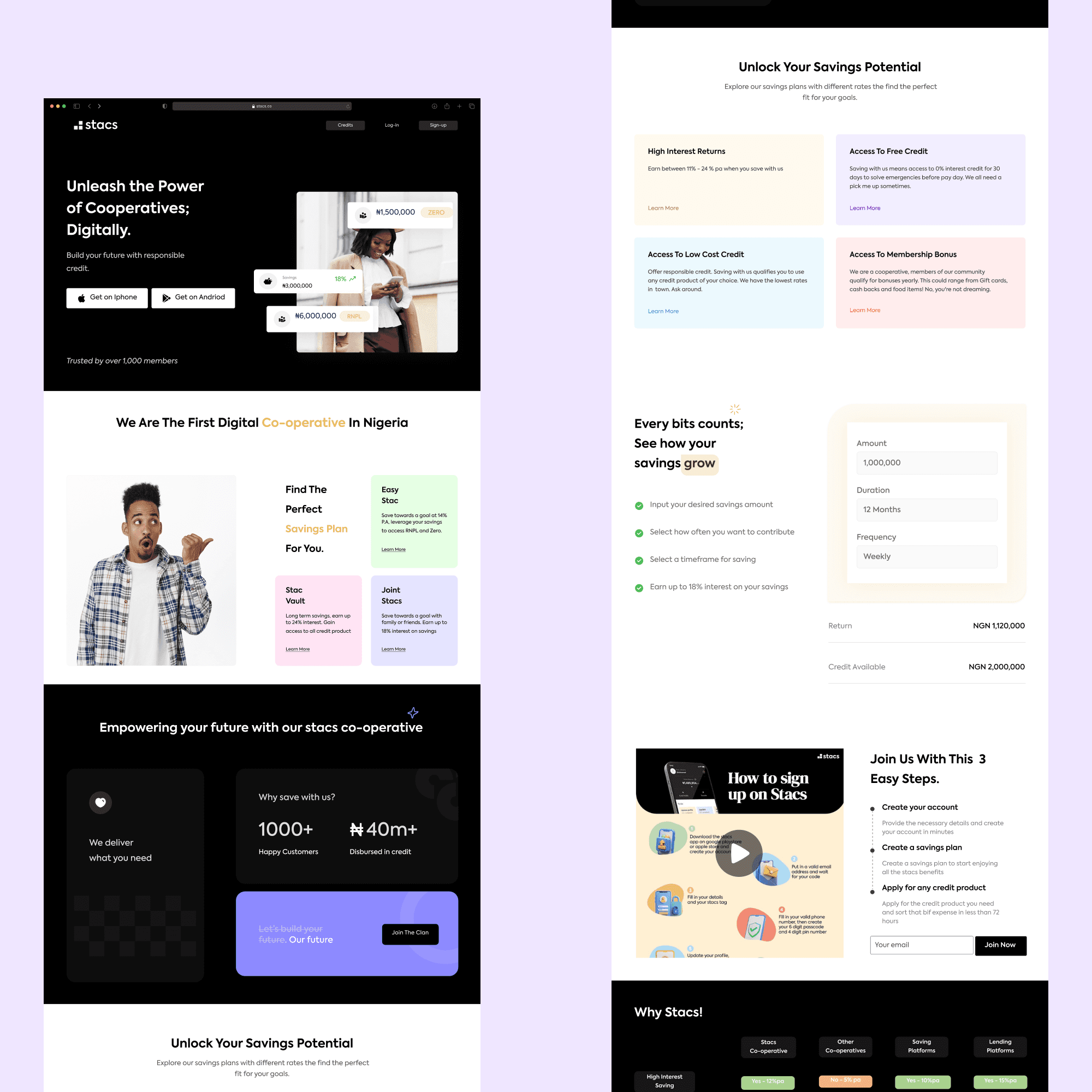
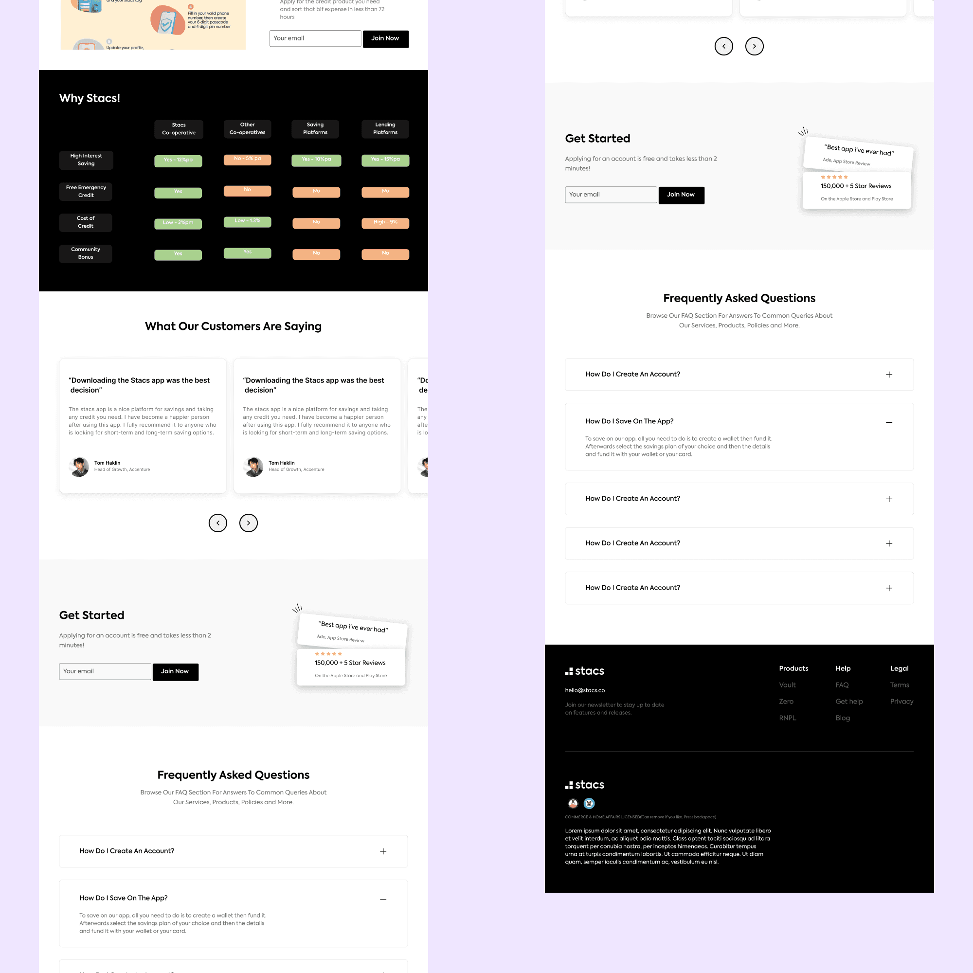
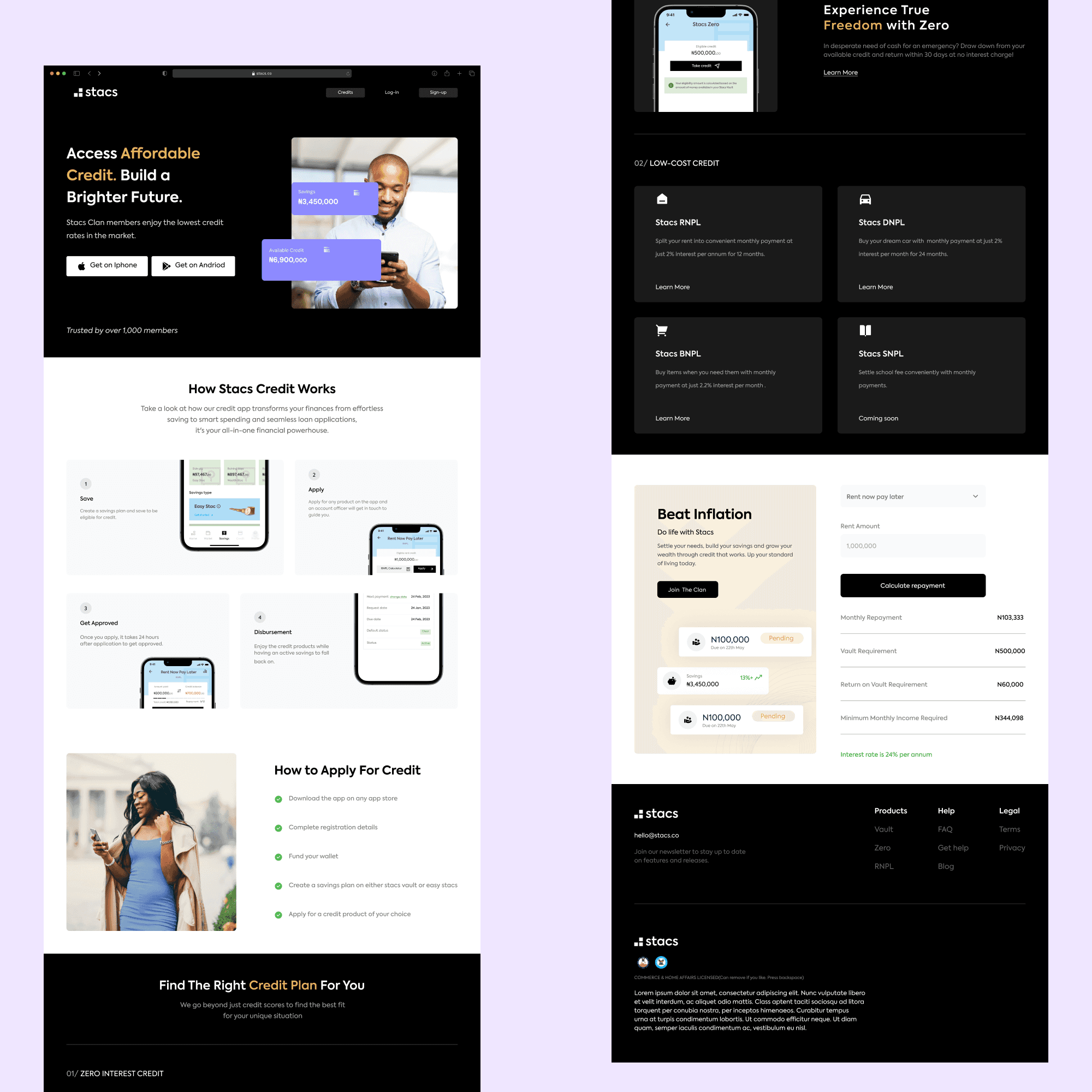
The redesign led to a 45% increase in user engagement with credit and savings plans due to improved information clarity. The structured visual approach reduced user confusion by 35%, making it easier to compare options at a glance. Additionally, simplifying the UI led to a 25% boost in conversions, proving that design plays a crucial role in financial accessibility.